Page 85 - Gričar, Sergej, Barbara Rodica and Štefan Bojnec, 2016. Sandwich Management. Koper: University of Primorska Press
P. 85
edisciplinarity of the Project – Web Application
Figure 25: Initial logo 85
Source: Own source 2014.
With an intention to distinguish our company from competitors, we
included in our logo a text as well which in written in English (Figure
26). Our logo is presenting a sandwich which may reminds us on graphics
which are usually seen in cartoons. We avoided any kind of potential mis-
leading of customers with a logo that might be a photo of a real sandwich
taken from a website. The whole idea of using a cartoon logo is to engage
the imagination of the customer concerning what we offer.
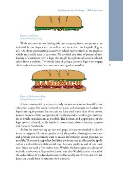
Figure 26: Final version of logo
Source: Own source 2014.
It is recommended by experts to only use one, or at most three different
colors for a logo. The colours should be warm and associate with what the
logo is trying to present. In our case we have used more than three colors,
mainly because of the complexity of the final product and to give custom-
ers as much visualization as possible. The bottom and upper parts of the
logo present a bread, while inside it shows: ham, cheese, lettuce, tomato
and the text ‘Sandwich’.
Before we start setting up our web page, it is recommended to clarify
its main purpose. Our main goal is to sell the product through our web site
and provide our customers with as much information about products as
possible. The second step when building a web site was to allocate the appli-
cation a web address which would stay the same until the end of our busi-
ness. Since we used a free online tool, Weebly, the latter gave us a choice of
web address between Pkpsandwich.com and also Weebly.com at the end of
the web address. If we decided to remove the weebly word from our web ad-
dress, we would have to rent our own domain.
Figure 25: Initial logo 85
Source: Own source 2014.
With an intention to distinguish our company from competitors, we
included in our logo a text as well which in written in English (Figure
26). Our logo is presenting a sandwich which may reminds us on graphics
which are usually seen in cartoons. We avoided any kind of potential mis-
leading of customers with a logo that might be a photo of a real sandwich
taken from a website. The whole idea of using a cartoon logo is to engage
the imagination of the customer concerning what we offer.
Figure 26: Final version of logo
Source: Own source 2014.
It is recommended by experts to only use one, or at most three different
colors for a logo. The colours should be warm and associate with what the
logo is trying to present. In our case we have used more than three colors,
mainly because of the complexity of the final product and to give custom-
ers as much visualization as possible. The bottom and upper parts of the
logo present a bread, while inside it shows: ham, cheese, lettuce, tomato
and the text ‘Sandwich’.
Before we start setting up our web page, it is recommended to clarify
its main purpose. Our main goal is to sell the product through our web site
and provide our customers with as much information about products as
possible. The second step when building a web site was to allocate the appli-
cation a web address which would stay the same until the end of our busi-
ness. Since we used a free online tool, Weebly, the latter gave us a choice of
web address between Pkpsandwich.com and also Weebly.com at the end of
the web address. If we decided to remove the weebly word from our web ad-
dress, we would have to rent our own domain.