Page 43 - Fister jr., Iztok, and Andrej Brodnik (eds.). StuCoSReC. Proceedings of the 2016 3rd Student Computer Science Research Conference. Koper: University of Primorska Press, 2016
P. 43
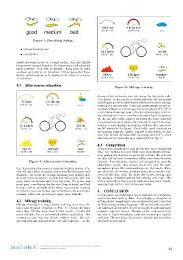
Figure 7: Describing feeling. Figure 9: Mileage training.
• mileage training and strong yellow section to save his energy for the whole ride.
• competition. The answer on the question, which asks why did the cyclist
reach higher power in after-season relaxation than in mileage
Result are constructed on a single cyclist, who had fulfiled training is a bit complex. First, the power shown on the vi-
his personal dataset based on his experiences and uploaded sualization figure is not average, but normalized (NP). NP is
three different .TCX files to website. They have all been a correction of average power, due to rapid changes in train-
analysed and sent to our visualizer. It then generated three ing intensity and due to curvilinearly physiological responses
figures, which suppose to be shown in the athlete’s calendar [8]. In the first result, athlete probably did some intervals
of activities. (escalating intensity) during the training to stretch his legs,
which are rapid changes in intensity, and therefore improved
4.1 After-season relaxation his NP shown in the figure. Practically, rapid intervals on
the training make NP higher. Oppose to first result, at this
Figure 8: After-season relaxation. long ride, athlete did save with his energy and did no short
Fig. 8 presents after-season relaxation training session. Cy- intervals and no intensifying is observed from Fig. 9.
clist did quite short training, what is seen from distance and
duration. Its colors are orange, meaning that athlete only 4.3 Competition
did half of his maximum. Cyclist did rode slowly, with low
pace, what can be also seen from his pulse. His power was Competition visualization is as at first seen very relaxational
quite good, considering the flat ride (low altitude) and bad (Fig. 10). Athlete did only little more than twenty kilome-
feeling. Cyclist probably did a short, regenerative training tres, getting the distance curve barely noticed. His ride last
in order to raise his feeling and performance for next day’s for only half an hour, identifying yellow color from duration
training, which will probably be much more difficult. element. But otherwise, athlete had struggled at most by
other three results - his average heart rate was 182 bpm,
4.2 Mileage training normalized power 294 watts and velocity 43.2 km/h. They
are all in the red section, meaning that athlete surely com-
Mileage training is a long, distant training, seen from dis- peted at the time trial. He chose flat course, having only
tance and duration elements on Fig. 9. Cyclist did train few altitude, therefore getting his velocity very high. His
more than 100 km more than in first result. Cyclist did feeling was bad, at strong south-west wind and some clouds,
much altitude, due to red colored altitude indication. The meaning that cyclist could drive even faster.
weather on that way was cloudy, without wind. His feel-
ing was medium and his heart rate like expected - in the 5. CONCLUSION
In this paper, we presented a novel approach for visualizing
most important cycling data. Accordingly, a visualizer in
editing studio ImageMagick was implemented and controlled
by Ruby programming language. We practically executed
our approach and showed, that it is possible to automatically
generate expected figures. Results of the performed work
are, due to rapid visualizing (only five seconds per figure),
excellent. The precision of process is valuable and resolution
of figures is acceptable.
StuCoSReC Proceedings of the 2016 3rd Student Computer Science Research Conference 43
Ljubljana, Slovenia, 12 October