Page 41 - Fister jr., Iztok, and Andrej Brodnik (eds.). StuCoSReC. Proceedings of the 2016 3rd Student Computer Science Research Conference. Koper: University of Primorska Press, 2016
P. 41
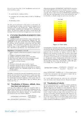
can be seen from Fig. 2, the visualization process is di- After obtaining result INTERPRET DISTANCE , which lies
vided into three parts: in the interval [0,1] a color for the distance curve is selected.
Ten colors are available for ranging the intensity of cycling
• completing the training session, elements. If the result of distance is INTERPRET DISTANCE =
• uploading and processing data, as well as visualizing 0.45, then the corresponding color in interval [0.4, 0.5] will
be selected, i.e., bright orange as can be seen from Fig. 3.
results,
• informing cyclist.
The first part is dedicated to the cyclist in real world. Af- Figure 3: Color table.
ter completing his training, recorded data is transmitted to
computer world in the second part. There, they are be- Interpretation of altitude and duration is performed on the
ing processed, visualized and displayed on the website as a very similar way, while interpretation of heart rate and power
result. In third part cyclist can inform himself about the is a bit more sophisticated. It should be mentioned, that it
training’s effort and therefore struggle even more next time. would be silly to interpret, for instance heart rate HR =
56 bpm on the training, because this can mean that cyclist
3. CYCLING TRAINING ELEMENTS VISU- did not actually move. To prevent appearance of such errors,
ALIZATION we suggest to add besides the set of maximum values also the
set of minimum values. Consequently, actual data should be
The visualization process is performed using a software suite spread between minimum and maximum values, e.g. heart
ImageMagick and Ruby programming language [2]. Im- rate should be drawn from interval HR ∈ [120, 180] bpm.
ageMagick is the open source text-mode editing software Accordingly, Eq. (1) transforms into Eq. (2):
for pictures, which excellently collaborates with the Ruby
language. This combination of software was applied in our INTERPRET POWER = actual power − min power , (2)
study because of high adaptability, simplicity and integra- max power − min power
tion. Algorithm 1 presents the basic visualization process.
where INTERPRET POWER ∈ [0, 1]. If the actual power
Algorithm 1 Visualization principle is lower than min power, the min power is taken into ac-
1: Athlete uploads cycling activity dataset to tracker’s web- count and actual power is disregarded.
site; As a result, listed elements are colored in the appropriate
2: Analysis of uploaded dataset begins; color and finally added (imported) into the primary figure.
3: Analyser forwards extracted data to visualizer;
4: Visualizer reads data and retrieves personal dataset; 3.2 Visualization of velocity
5: if Personal dataset should be updated then
6: Update personal dataset; As seen in prototypical Fig. 1, velocity, weather and feeling
7: end if are not presented by color, as other elements. Therefore, a
8: Visualizer downloads actual weather report; different approach was studied for those elements. One of
9: Visualizer interprets data to become information; the most self-explaining principles of presenting velocity in
10: Visualizer generates a figure and forwards it to website; general is using a simple indicator with three background arc
11: Website presents the visualized figure of the training colors. In fact, reading the slope of the indicator is the easi-
est way to determine velocity and that is the reason for em-
activity session; ploying it in our application. Background arc colors can be
pre-drawn and pre-imported into file to make whole process
Algorithm 1 presents the standard visualization process, tak- easier, but indicator has to be programmed and processed
ing into account both of the accessories (i.e., heart rate mon- at the moment of visualization, indeed.
itor and power-meter) by default. It should be noted, that
the visualization process is adjusted, when cyclist does not
use any of them and visualization figure is different than
shown one (Fig. 1).
3.1 Visualization of distance, altitude, dura-
tion, heart rate and power
Let’s say, that analysis part has been completed and ex-
tracted data are ready to be interpreted. Interpretation ac-
tually means comparing extracted data from tracker and
values obtained from personal dataset. An example shows
the comparison for the distance element:
INTERPRET DISTANCE = actual distance , (1)
max distance
where INTERPRET DISTANCE ∈ [0, 1].
StuCoSReC Proceedings of the 2016 3rd Student Computer Science Research Conference 41
Ljubljana, Slovenia, 12 October